
Layout Design Needs Breathability
Text layout design is a lot like interior design. Imagine you’re walking into a room, and it’s filled with furniture. The walls are covered with pictures, tchotchkes on every surface, throws and throw pillows galore. You can’t really focus on any one thing because there’s just too much. But something is missing.

What’s missing? Space.
Space
No, not the final frontier, but what we call white space. This doesn’t mean it has to be white – it means empty of clutter. This is the first principle I want to bring up today, because it impacts not only interior decorating, but also graphics, word processing (for print or digital), email, web copy, etc.
You have something you want people to notice or read. When the most important elements are well organized, it helps your audience to focus on it. Less clutter on the page, email or brochure means less clutter in the brain. When there’s less clutter, information is more easily absorbed.
So, how do we add white space in our text layout?
Let’s start with MS Word. First of all, you don’t have to use Word’s default settings. In Word you can, for starters:
- increase margins
- increase line spacing
- increase paragraph spacing
- add bullets
In fact, you also can (and often should) break up long sentences and paragraphs more than we did back when we wrote school essays in the old days. Why? Because our attention spans are getting shorter as we get more and more used to reading in the text equivalent of soundbites. (Also, on the web, shorter sentences rate higher for search engine optimization.)
Spacing, sub-headers, and bullet points make the information more digestible and easier for the brain to absorb.
Here’s a trick I often employ — see if it works for you. Try reading a paragraph to yourself and imagine speaking it, or even read it out loud. As you do so, think about where you would take a pause or a breath. That is often a good place for a paragraph break.
As useful as this technique is for print copy, it is even more important for web copy readability.
Let’s take a look at these 2 examples filled with dummy text. Which one is easier to read?
With more spacing, sub-headers, and bullet points, the sample on the left makes the information far easier for the brain to absorb and digest. These same principles work for web content.
White space also brings us to…
Margins in Design
Space isn’t only critical inside the body of text, but also around it. Margins are also in graphic design layout. One of the things I see perhaps most often from non-designers, even those with a good eye, is allowing content to get too close to the edges of the graphic, the ad, the business card, the meme, or whatever they’re creating.
Aside from the breathing space I was just talking about, if you are creating something that will be professionally printed, it can create issues when the printer has to trim the material.
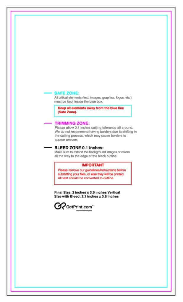
If you’ve ever tried to upload a design to a commercial printing service, you may have been advised to work with a template that looks somewhat like this.
Things you have printed at a professional printer are cropped from a larger piece of paper. The pink trim mark is where the printer will be making the cuts. As much as they try to be accurate, it is not always 100%. By making sure you are well inside the turquoise safety line you will avoid having your text uncomfortably near the edge of the card.
Fonts
Using the right font is also paramount for readability. How many times have you encountered a webpage with too-light gray text, or gotten a business card with thin white text on a dark background that was hard to discern?
We can have fun with headlines and display type, but for essential “reading” content (“body” text), don’t make it:
- too small
- too thin
- too condensed
- too light (thin) on a dark background
- text on top of a busy pattern or photo
Also, use an inappropriate style for your end-user. You wouldn’t use the same font and type size for a pre-schooler that you would for a college-age student. In the same vein, keep in mind that young adults can read smaller print than an older adult who often needs an increase in both size and contrast. (Did you know people over the age of 55 comprise 34% of the US population?)
How many typefaces should you use? The general rule is two, three at the maximum. While we can’t get into how to match and complement fonts today, I’d say if you stick to the two typeface rule that’s a good starting point. We want to avoid confusion and distraction.
When You’re Almost Done
Make sure everything is in order. If you can, get someone to proofread. (Caveat: I don’t have anyone to proofread today, so I disavow any typos in this article!) Use your app’s spelling and grammar check. And if your piece is for print, print it out and make sure it looks the way you want.